It takes less than a second for most people to state their favorite color when asked. Often times this is a color that has enveloped their personal preference for years, perhaps for as long as they can remember. Likewise, a nice scrunch to the face, head shake or derogatory statement is made when people hear (or see) that one color they wish no longer existed.
People spend their lives filling their wardrobes, choosing bedding and bath towels, and making artwork choices covered with the colors that speak to them–so why not get serious about the color you fill your home with?
There is plenty of psychology research out there on color theory, personality traits and other identified connections between human life and color selections. We won’t get into all of the nitty-gritty about your mind, but I dare you to take one of those online color quizzes and have a color chosen that doesn’t represent you–they are scary accurate!
So, what does color tell us about your mood? More importantly, how do we become intentional about selecting colors that bring the feel, atmosphere and interactions that you dream of in your new space? After all, No Drip Painting is all about creating spaces worth sharing-so lets create spaces the give you the outcome you wish to share!
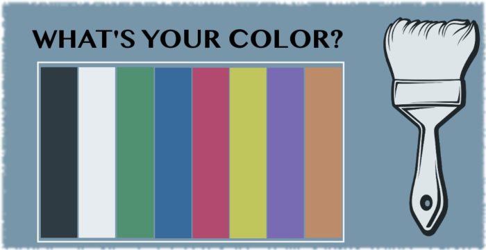
Take a look at our two-tiered chart that explains common words associated with your color preference, as well as the moods you may wish to elicit by choosing to revamp your space in these colors. (Now-these are just the base colors–the feel of the room may be significantly adjusted by changing the tone and depth of color.)
[supsystic-tables id=6]
We hope that you will use this chart as a springboard for the design in your next room overhaul. Walls are perhaps the largest blank canvases we have in our homes and are often the most underutilized. Your room of course needs to suit you, make you feel good, and give you that forever comforting sense of ‘home’, but don’t overlook what you hope to use the room for and how you want others to feel when they visit.
Need one more quick tip? Never underestimate the power of balance! Many designers and color experts will tell you to look at colors that sit opposite on the color wheel. For example-blue and yellow. Blue will bring your space a calming sense of harmony and spirituality, while splashing in yellow will bring you just enough zest, energy and cheerfulness.
….and if you were wondering, over here at No Drip Painting, green is our favorite color.
Happy Painting!